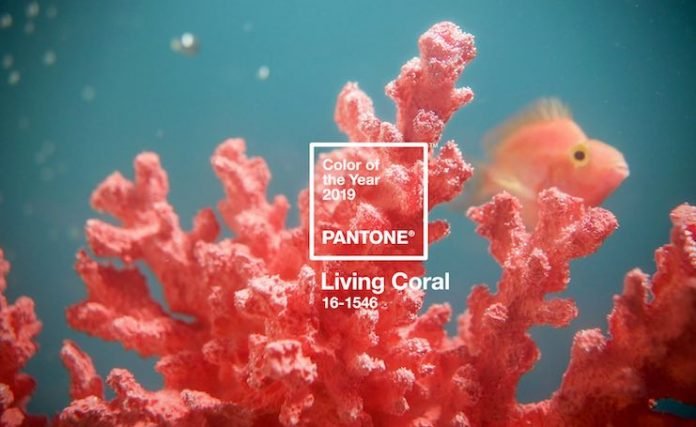
Pantone recently announced the Pantone Color of the Year 2019: PANTONE 16-1546 Living Coral. According to the company, the shade of orange with golden undertone signified how humans draw energy from nature—just as coral reefs are a source of sustenance and shelter to sea life, Living Coral is a color of warmth and nourishment to provide comfort in an ever-changing, ever-shifting world, the company adds. Five hospitality designers—Lela Richardson, senior project designer, Wilson Associates’ Dallas studio; Lesley Hughes Wyman, principal, MatchLine Design Group; David Shove-Brown, partner, //3877; David Tracz, partner, //3877; and Justin Colombik, studio director, Puccini Group—weigh in on this color choice, and what it means for 2019 hotel design trends.
What do you think of Pantone’s Color of the Year?
Lela Richardson: “I love Pantone 16-1546 Living Coral! It’s vibrant and fun; and best of all, works beautifully with different shades. It’s a color that not only contrasts perfectly with neutral tones and dark shades but excels in brightening the mood of any interior space. This trending color has already made a strong impact in the fashion world and is now making its way into stylish interior designs.”
Lesley Hughes Wyman: “It’s energizing and refreshing! We had started adding pops of coral and chili pepper recently in our schemes as an accent. It adds a natural brightness. Because the color has a hint of a warm orange tone, it’s made more palatable and mixes well with many colors. It’s less specific as just a pink alone.”
David Shove-Brown: “It’s a safe option. In a time when our world is filled with anger and conflict, the color is cool and calming. It doesn’t promote controversy, debate, or discourse; it is truly safe.”
Justin Colombik: “I love coral! I grew up in 1980s and to me it’s a very late 80s color that is so flexible—especially with more of the warmer finishes I like incorporating into the spaces I design.”
What potential do you see for hotel designers to incorporate Living Coral into their approach?
Lela Richardson: “Living Coral has enormous potential as an accent color for FF&E applications. My advice for other designers is to balance Living Coral with natural color palettes, especially greens and blues, in thoughtful ways for hospitality spaces. For guestrooms, in particular, I recommend using Living Coral discreetly as an accent so the vibrancy does not overpower the other shades in the space.”
Lesley Hughes Wyman: “It’s a great accent color that actually does work well with quite a few palettes. It could provide a nice contrast with emerald and kelly greens, and, of course, with sky blues and turquoise shades. The color is an obvious selection to incorporate well into coastal properties. Coral can take on a more sophisticated tone when mixed with a neutral palette of creamy colors, warm grays, navy, and warm cognac tones. Subtle integration is best unless it’s a location-specific property. It’s easier to rotate trends in and out through accent colors.”
David Shove-Brown: “I see Living Coral as a background color; it isn’t strong enough to lead the design so it will become a secondary or tertiary color.”
Justin Colombik: “It defies being hidden, and demands to be the focal point. When surrounded by warmer neutrals, it’d make a spectacular furniture piece or central art piece.”
What’s the biggest trend you expect to see in hotel design in 2019?
Lela Richardson: “The desire for a connection to nature will continue throughout 2019, and Living Coral is further proof that this trend is here to stay. Colors, materials, patterns, and textures that capture elements of nature will continue to liven hospitality spaces and create an organic sense of place.”
Lesley Hughes Wyman: “With color, we are still seeing the growing trend toward brighter and bolder colors that are derived from nature, making these colors much more relatable when you understand the ‘roots’ of the design. Incorporating even more types/elements of natural-based materials throughout the space. Natural materials inherently add warmth to a space. Guests seem to crave the mixed moods of wellness, comfort, and feeling energized.”
David Tracz: “Neon signs have had their time in the spotlight. Taking an exit stage left, these whimsical, albeit cheesy, signs have been overdone and overplayed. Adding a pop of color to accentuate a larger design scheme at work will still be popular, but achieved through other means, such as muted metallic detailing and tactile elements.”
Justin Colombik: “Travelers are more attuned to hotels that feel anonymous and corporate; hospitality is moving toward spaces that are connected with their contexts in a meaningful way, that give travelers an authentic connection to their destinations.”


