National Harbor, Md., has a vibrant, lively atmosphere, and the Hyatt Place National Harbor was designed to bring the spirit of the area into the hotel. The property’s lobby elements were conceptualized after National Harbor itself, and the entryway of the hotel is “an LED custom art installation that’s actually an abstraction of the National Harbor skyline,” describes Sam Forman, an architect for //3877, the firm that designed the hotel. Surrounding the art installation, the lobby has a monochromatic yet comforting color palette that trickles into the lobby bar. Inspired by the landmark Ferris Wheel on the Potomac River, the half-circle lobby bar is meant to “draw users throughout the space,” Forman says. He adds, “We wanted to create special moments that allowed people to interact with different areas of the hotel.”
Principal and co-founder of //3877 David Tracz adds, “We were very strategic about how we integrated food and beverage and where it was placed in the building to draw people in.”
The Hyatt Place National Harbor was also the first property in the United States to implement Hyatt Place’s new guestroom design prototype. To ensure the project’s success, the //3877 team traveled to the Chicago Hyatt headquarters to see the prototype first-hand before implementing it at the National Harbor hotel. Forman explains, “We were able to make custom suites embody the prototype while bringing in some additional features that we wouldn’t have otherwise been able to do.”
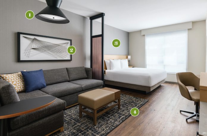
1Updated Lighting
The lighting in the new prototype has been modernized, notes Forman. “The previous guestroom design had a lot more wood tones and a lot of beiges. The new prototype has a black metal detail, which wasn’t seen previously. The light that’s over the cozy corner and some of the ones found in the headboards show that modern design.”
2Anew Look
The guestroom artwork is “very geometric and angular,” Forman describes. “Just black and white is very rare for Hyatt Place. They used to have biophilic and floral patterns in the artwork, and they’ve moved away from that into something much more modern and neutral.”
3Neutral Tones
Light wood case goods and dark wood flooring set off the neutral color palette in the guestrooms. Forman says the neutral guestrooms “worked really well with this design. It also complements the other areas of the hotel.”
4Detailed Textures
Because the pace has a very neutral color palette, the textures are what bring the guestrooms to life. “The texture makes sure the room doesn’t feel flat,” Forman adds.


