In December, Red Roof announced the latest addition to its soft brand, The Red Collection: the upper-midscale SPOT X Hotel – Orlando/International Drive. Location is key for this 154-room, new-build property, and the name “SPOT X” emphasizes the hotel’s positioning as the place to be in Orlando, with access to the area’s theme parks, shopping, dining, golfing, and more. The “SPOT X” branding came after the hotel’s ownership group, in the midst of developing the property, decided to switch flags to The Red Collection. Michael Sharp, Red Roof’s vice president of design and construction/procurement, says that when construction costs began to skyrocket, “The ownership group gave us the opportunity to go in and value engineer to determine the type of budget that would deliver a spectacular finished product.”
Heather Cox, director of procurement, design, and construction, adds that the Red Roof team worked closely with the hotel’s ownership group to execute their vision of a design that showcases the side of Orlando that many travelers visiting the region’s theme parks often don’t see. Inspired by the orange blossom, Florida’s state flower, the lobby design contrast bright, sunny colors with the bold blues of a clear sky and sparkling lake water, which are depicted in a centerpiece wall mural honoring local landmarks. “The design highlights this hidden gem in the city of Orlando—X marks the spot,” Cox adds. The hotel will cater to a variety of guests—from budget-minded vacationers to business travelers to international clientele, particularly those flying in from South America to shop at the nearby Orlando Premium Outlets and enjoy local attractions.
1Shaping the Theme
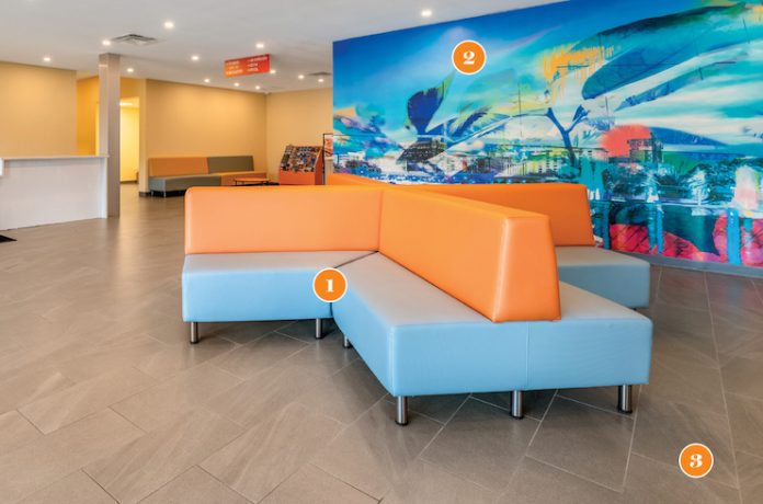
The lobby design incorporates the hotel’s signature “X” shape in its eating ears, seating, and a central lighting fixture. “That brings home the idea of ‘X marks the spot’—you have arrived,” Cox says, adding that the modular seating is movable and can be rearranged to change the look and feel of the space.
2Selfie Spot
The wall mural is a focal point in the lobby and a convenient “selfie spot” for arriving travelers, Cox says. “When guests walk in, they feel the energy of the citrus tones and vibrant blue. The large mural is directly across from the entrance and serves as our ‘wow’ factor,” Cox explains.
3Inherited Finishes
Cox notes that the ownership group initially developed the property to fly another brand flag, but switched to The Red Collection due, in part, to the rising costs of FF&E. As such, the design team had to incorporate existing elements like the flooring, which became a neutral background for the lobby’s lively colors.


