Check Out the Vintage House Lobby at The Estate Yountville

In the center of Napa Valley wine country, The Estate Yountville is a 22-acre compound composed of two ultra-luxe lifestyle hotels, a spa, dining complex, and event spaces. The Estate is currently in the midst of a transformation, with massive renovation projects updating the property and bringing it into the current day. Of the hotels, Hotel Villagio faces downtown and will offer a more “clubby” atmosphere when it reopens this spring.

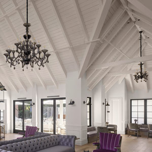
Vintage House, which reopened in November of 2017, faces the residential area of town and has the feel of a contemporary farmhouse. The 80-bungalow property’s color scheme is a sophisticated lavender and gray, while the walls are adorned with playful artwork. For example, one piece shows a man gazing through binoculars. If guests follow his line of sight, they’ll see that he’s looking across the room at another piece of art featuring a woman. These details really elevate the space, says Kathleen Dauber, a partner at hospitality design firm Hirsch Bedner Associates (HBA). Dauber talked LODGING through the details of Vintage House’s lobby.
Vintage House Lobby Staircase
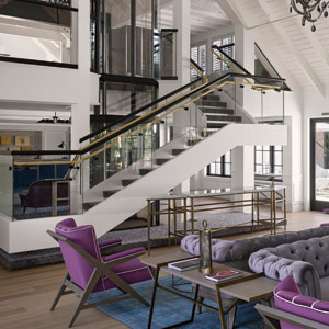
Celebrated Staircase—In a room that can house bridal parties and reception dinners—among other functions—the grand staircase is the focal element of the space. “It has a celebratory, showcase quality, and it was our desire to create a showcase element for anybody going up and down the stairs,” Dauber says.
Vintage House Lobby chandelier
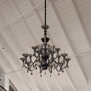
Striking Chandelier—Dauber notes, “The idea was to introduce a sense of luxurious, curated glamour. Putting Italian glass in a black chandelier is striking, and we loved the contrast. It’s timeless but modern, and that was our goal.”


Advertisement


Vintage House Lobby ceilings
Splendid Ceilings—Part of the hotel’s original architecture, the charming white beams shows the beauty of the renovated building. Dauber says, “We kept that architectural language and loved the white, contemporary aspect of exposing the ceilings and highlighting the volume.”
Vintage House Lobby Furniture
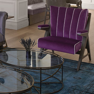
Barely There—Furniture with thin bearings and clean lines was chosen to eliminate visual clutter. “We were looking for compliments to the interior, not something that overtakes it with the heaviness and weight of the furniture itself,” Dauber describes.
Previous articleAHLA Names Rosanna Maietta President of Foundation
Next articleOn the Move: This Week’s Comings and Goings
Robin McLaughlin
Robin McLaughlin is digital editor of LODGING.