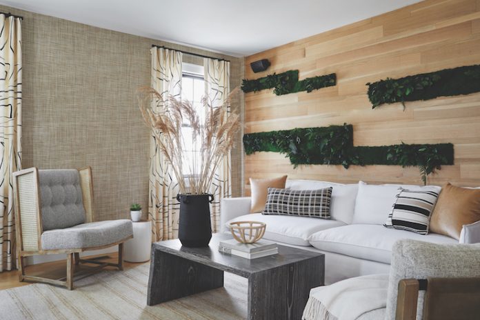
Taking inspiration from the farms and gardens that line Martha’s Vineyard is The Edgartown Inn, a Lark Hotels property. Designed by Rachel Reider Interiors, the property’s modern farmhouse aesthetic is a nod to the history of Martha’s Vineyard without focusing on its renowned coastline. Once a sea captain’s home, The Edgartown Inn comprises 12 guestrooms, each with a different layout and design, which makes the property stand out from others in the area. Most of the guestrooms have private balconies and all include access to breakfast, bath amenities, and beach chairs. Throughout the property, natural materials such as rope, linen, and wood were paired with a light-toned color palette. This combination adds a farmhouse feeling to the design.
Rachel Reider Interiors has been involved in the design of other Lark Hotels in Martha’s Vineyard, including The Sydney and The Richard. Rachel Reider, principal of Rachel Reider Interiors, believes that “brand and design can and do go hand-in-hand.” She described her approach to The Edgartown Inn’s interiors, “We thought it could be fun to pay homage to the agricultural history and 40 working farms on the island, and to celebrate that agricultural culture, spotlighting all of the interesting food and produce that come from the island. That segued into the idea of a modern farmhouse.”
Texture-Forward
Reider intentionally incorporated lots of texture in the space to make it more intriguing—even in the wallcoverings. The wallpaper is “a highly textured woven grass cloth,” Reider describes. “Not to sound like a broken record, but we really love to play with different textures and materials to create a layered and rich environment.”
Pops of Plant
Putting plants around the property not only adds to the overall texture of the space, but it also makes the space feel more comfortable. Reider says, “We wanted to bring in the natural environment, and I think the pops of green add a lushness to the space that breathes life into it.”
Living Wall
Texture and greenery allows the property to not feel “overly themed,” as Reider says. The tones are strategically placed to “create this really rich, highly textured backdrop.” She continues, “That came into play with the materials and finishes, which rely heavily on texture and natural materials to bring forth the idea of modern farmhouse.”
Mix-and-Match
The coffee table came from a Midwestern craftsman that Reider had worked with on previous projects. She chose to work with this vendor again specifically because they use natural materials in their designs. The table works in the space because “It really brings forward interest when things work together cohesively but don’t necessarily match,” Reider explains.


