The 24-year-old, Bay-Area hotel Inn Above Tide recently completed a renovation that added three new suites to the property. Generally speaking, the hotel’s design draws inspiration from the surrounding area and especially the sea, with modern nautical references found in the décor throughout the hotel.
With 33 guestrooms and suites, Inn Above Tide allows guests to fully immerse themselves in the property’s location, with some suites even offering decks that lead directly to the San Francisco Bay. The three new suites each bring something different to the property: The Founder’s Suite, which honors the memory of original owner William “Bill” McDevitt, is located in his former apartment; The City Lights Suite sits adjacent to and can connect with The Founder’s Suite to support large meetings and events; and The Vista Suite on the second floor has been completely renovated, with an outdoor patio facing the Golden Gate Bridge. The new suites can transition from intimate spaces to dynamic areas that accommodate corporate events.
General manager of Inn Above Tide Mark Flaherty says, “Folks have appreciated the interior design, and artwork is unique and pulled from the region. The space is personalized, and makes for an unusual hotel experience and positive guest reactions.”
Kitchen Hideaway
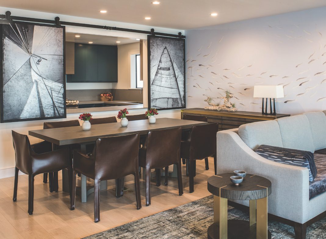
Barn-style doors featuring sail photography close to separate the kitchen from the rest of the suite. According to Antonio Martins, interior designer for Inn Above Tide, they wanted something that could open and close easily depending on guests’ needs. “They look great too,” he adds.
Looks Like Home
Inn Above Tide’s furniture was designed and arranged as though it would be in someone’s home. “We didn’t want anything to be too trendy,” Martins says. “There are beautiful boutique hotels that
right now are super trendy and cool, but they
won’t be in 5 years. This is warm, homey, and creates sophistication in the space.”
Bringing in the Bay
The suite’s wallpaper (figuratively) brings the water right into the room. Martins explains, “The wallpaper looks like fish are swimming around inside the room, like they have swum in from the Bay.” He adds that the artwork serves a similar purpose. “We have three to four landscape paintings of the Bay Area to bring the outside in.”
Modern Colors
Because the hotel highlights the water and views, the wall and furniture colors are meant to draw guests’ attention to the outdoors. Martins adds, “The whole hotel is about the Bay, the views, and the color of the sea. Depending on the time of day, there’s a seamless transition between the room and the Bay.”


