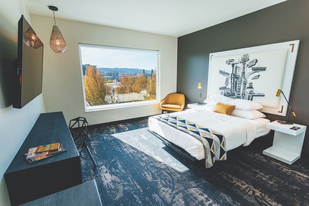
From its humble beginnings as an 81-room motor lodge in 2004, the Jupiter Hotel re-opened as a sleek, modern motel on the east side of Portland, Ore. Across the street from that vision, Jupiter NEXT is the sister location to the original concept, offering a completely different vibe. Sophisticated and modern, Jupiter NEXT has details that guests can get only from an authentically Portland property. Owners Kelsey Bunker and Tod Breslau are area locals and are absolutely dedicated to bringing Portland realness to the hotel.
The 67 guestrooms come in three different sizes and styles, the biggest being the XL suite, where guests are offered dining and living spaces, as well as access to a private guests-only terrace. The property’s eateries—which include Hey Love restaurant, bar, and lounge, as well as lobby bar Hey Love Superette, which offers coffee from Proud Mary and pastries from Fleur de Lis—are open to both guests and Portland locals. The property’s focus is on affordability, giving all guests—whatever their means—the opportunity to experience genuine, traditional Portland. Restaurants, breweries, and marketplaces can be found nearby for guests to explore.
Interior designer Megan Millie, who worked on the property’s design, says, “A literal combination of old and new became the conceptual framework for developing and designing a narrative that is as vibrant and diverse as the original hotel. The concept was explored throughout with the use of evolved materials, layered textures, contrast, opposites, and deconstructed patterns.”
Oversized Diversity
Each side of the building offers different views of Portland. On the eastern side, sunrises saturate the waterfront of the Willamette River and cityscapes of the east side and downtown areas. The western side features sunsets over Forest Park. And, Millie adds, “Some peaks can be found, too—it’s very diverse.”
Muted Color Concept
Various, neutral colors were chosen to reflect the property as a whole. “Black and white create a balance more than a juxtaposition,” Millie says. “You enter into the guestrooms on a concrete-like tile floor, echoing the first two floors of the hotel’s public spaces, where the building’s structure is expressed as much as possible.”
Angular Furniture
“The angles reflect the geometry of the building’s shape,” Millie says. “The building is not a box with four sides and a top—it angles in multiple directions. The outside design naturally found its way into the interior. We maintained a cohesive elemental design approach in all sections.”
Unconventional Artwork
Bedroom headboards are different in single and double rooms. Designed by local artist Beth Kerschen, they are composed of custom photography that “captures Portland through a multitude of different locations assembled together to create unique compositions,” according to Millie.


