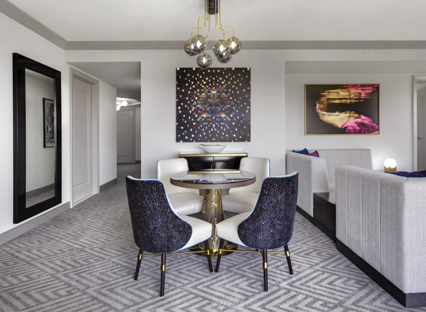
While Las Vegas is known for its flashy, show business esthetic, The Cosmopolitan of Las Vegas leans into a more contemporary, upscale side of the city. To introduce them to its renovated public spaces and gain their feedback on proposed room designs, the hotel had invited more than 400 employees and frequent guests to experience and choose a favorite among various guestroom designs. The winning design has now been implemented throughout property’s Boulevard Tower, with its Chelsea Tower due to finish renovations before the end of 2018.
The guestrooms are inspired by Las Vegas glamour, featuring playful artwork and classy furniture, but are also clean and modern. The vibrant accents create a youthful atmosphere in the neutral-toned rooms. There are also the Wraparound Terrace suites, which have a comfortable yet luxurious aesthetic, adding bright art to make the space pop. Each standout element throughout the renovation process was picked for its vivacity and liveliness against a plain backdrop.
Paulynn Aguilar, executive director of design at The Cosmopolitan of Las Vegas, comments, “The materials and finishes we chose are reminiscent of an urban apartment, but they are more durable to address the high-traffic Las Vegas clientele.”

Put-Together Pattern
“The carpet boasts a simple and classic herringbone pattern that creates a tailored look,” Anguilar describes.
Vivacious Artwork
In a property that is well known for its art collection, pieces are selected to grab guests’ attention and are “aligned with the larger collection by tastefully bringing a sense of playfulness and sensuality to the rooms,” Aguilar says.
Elite Lighting
“The same nightstand and reading lamps are used throughout all the rooms for practicality and functionality,” Aguilar says, but adds that the chandelier fixtures are exclusive to the Wraparound Terrace suites.
Color Pop
Soothing and contemporary neutrality allows the energy of Vegas to show through vibrant accents. Aguilar says, “Neutral tones of gray, cream, taupe, and black were chosen as a backdrop to allow for the more standout elements, such as colorful art and accent pillows, to really pop and create a dynamic energy.”


