
CRANBERRY TOWNSHIP, Pa.—The most impactful color trends for the upcoming year will be closely tied to nature, according to the color experts at PPG, which recently released its 2019 Color of the Year, Night Watch (PPG1145-7). Hand selected by PPG’s global color experts, this rich shade of green will be at the forefront of design trends in 2019 as it emulates greenery and nature in spaces.
“The restorative power of nature is important in society now more than ever,” explains Dee Schlotter, PPG senior color marketing manager. “Night Watch is about bringing the healing power from the outdoors into your home through color. The dark green hue pulls our memories of natural environments to the surface to recreate the calming, invigorating euphoria we feel when in nature.”
The urge to reconnect with nature in today’s society was a reoccurring theme during the PPG Global Color Workshop, held earlier this year in February. This annual workshop, which PPG began nine years ago, brings together over 20 PPG global color stylists across several industries to analyze the runway, lifestyles, demographics, geographies, and global and cross-cultural societal inspirations to determine what colors will resonate and represent the PPG global color forecast, including the PPG Color of the Year.
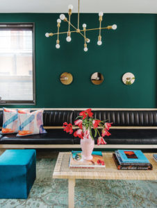
“Night Watch’s ability to invoke a deep connection to nature is universal, which allows the hue to be versatile for a variety of spaces and design segments–from healthcare to commercial and residential design,” adds Schlotter. “The color can be incorporated into interiors as a focal accent wall in a bedroom or dining room, and it pairs nicely with gold or brass accents and décor. It can be especially impactful in places without any view or tie to the outdoors, like the end of a windowless hallway of a hospital. For exteriors, Night Watch is a gorgeous alternative to the trending black or deepest blue-black, and it works well as an accent on doors and
shutters.”
In the architectural paint market, the forecast coordinates with trending materials such as textiles, wood, tile, cabinets, window frames, and more. PPG notes several other color themes for 2019 in four collections.
- With It — Colors that are youthful in spirit, playful, artistic, creative, and energetic. These hues reflect the optimistic drive, the collective nature, and the diversity of today’s young adults, but it is important to note that this theme is not defined by a certain age, but rather the collective spirit. The palette incorporates vibrant, lively hues like the Cherry Brandy, a cheery red; Crushed, a bold yellow; and Mystic Blue, a
playful blue. - With Class — Centered on old-school elegance, this palette offers a rainbow of saturated darks that convey a worldly tone while simultaneously expressing a contemporary aesthetic. Gem tones like Deep Emerald and Chilled Wine embody this palette, and softer tones like Hot Stone, a warm brown, and Cinnamon Diamonds, a unique red, offer a timeless feel that exudes sophistication and tradition.
- With Out — This theme represents consumers desire for simplicity and craving for only the things that make them feel healthy, grounded, and calm. This design aesthetic emphasizes an interest in minimalism and connectedness to the outdoors. The color collection boasts an abundance of nature-inspired greens like Pine Forest and Antique Slate, as well as organic colors like Cocoa Delight and Cool Concrete.
- With Spirit — This color collection addresses the rise of spiritual consumers who seek to infuse their interest in meditation, zen-living, mindfulness, and interest in the cosmos into their environment. Intense hues like bluish purple Imperial Purple evoke spiritual overtones, and pair well with colors like Wild Lilac that serve as softer, romantic accents.


